Note
Click here to download the full example code
Velocity arrows and confidence ellipses
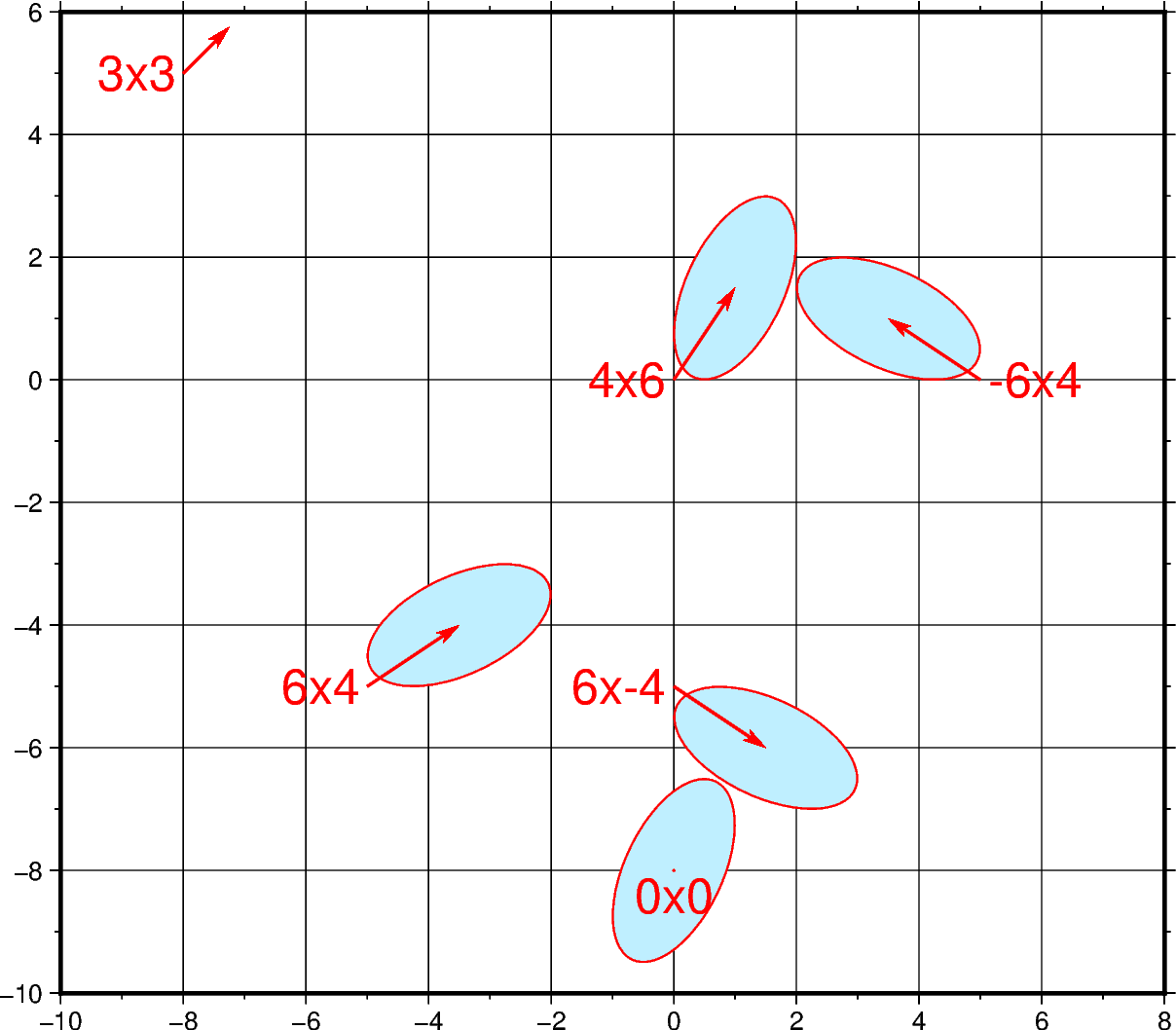
The pygmt.Figure.velo method can be used to plot mean velocity arrows
and confidence ellipses. The example below plots red velocity arrows with
light-blue confidence ellipses outlined in red with the east_velocity x
north_velocity used for the station names. Note that the velocity arrows are
scaled by 0.2 and the 39% confidence limit will give an ellipse which fits
inside a rectangle of dimension east_sigma by north_sigma.

Out:
<IPython.core.display.Image object>
import pandas as pd
import pygmt

fig = pygmt.Figure()
df = pd.DataFrame(
    data={
        "x": [0, -8, 0, -5, 5, 0],
        "y": [-8, 5, 0, -5, 0, -5],
        "east_velocity": [0, 3, 4, 6, -6, 6],
        "north_velocity": [0, 3, 6, 4, 4, -4],
        "east_sigma": [4, 0, 4, 6, 6, 6],
        "north_sigma": [6, 0, 6, 4, 4, 4],
        "correlation_EN": [0.5, 0.5, 0.5, 0.5, -0.5, -0.5],
        "SITE": ["0x0", "3x3", "4x6", "6x4", "-6x4", "6x-4"],
    }
)
fig.velo(
    data=df,
    region=[-10, 8, -10, 6],
    pen="0.6p,red",
    uncertaintycolor="lightblue1",
    line=True,
    spec="e0.2/0.39/18",
    frame=["WSne", "2g2f"],
    projection="x0.8c",
    vector="0.3c+p1p+e+gred",
)

fig.show()
Total running time of the script: ( 0 minutes 1.063 seconds)